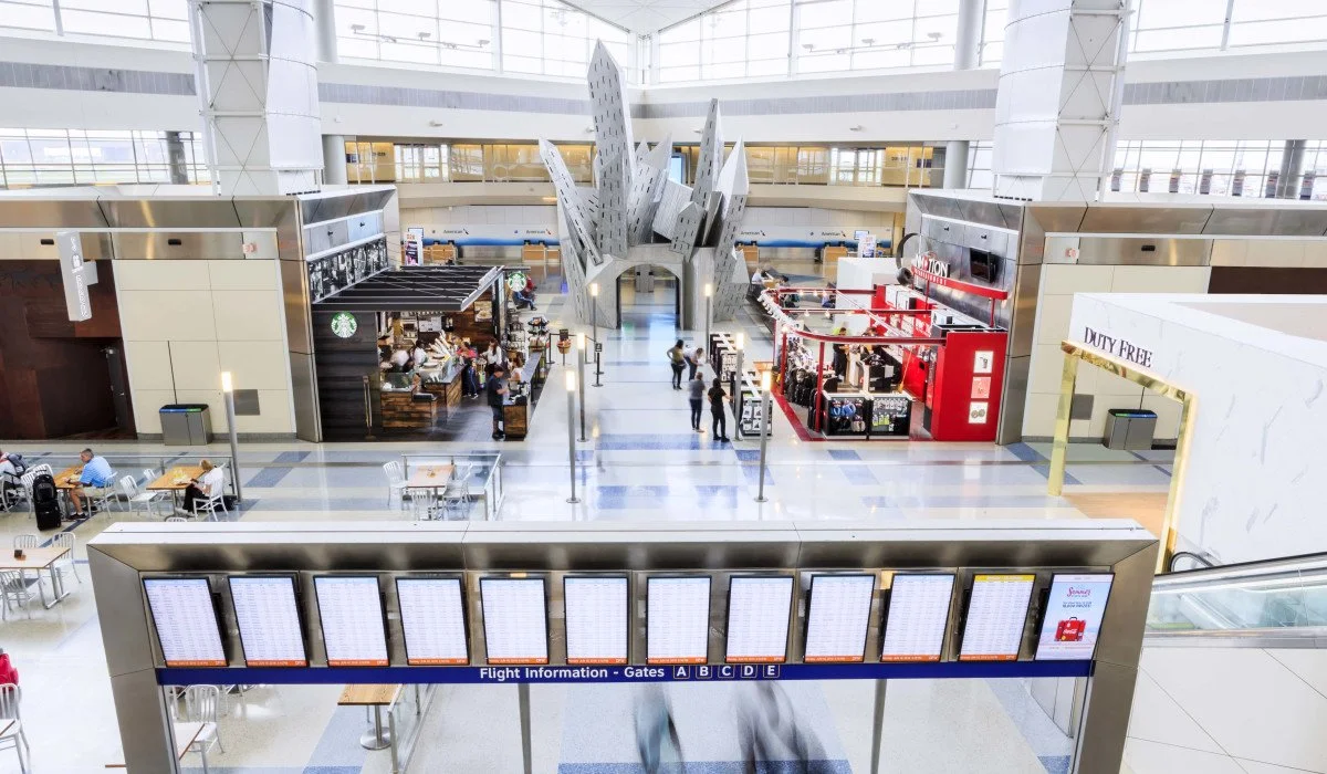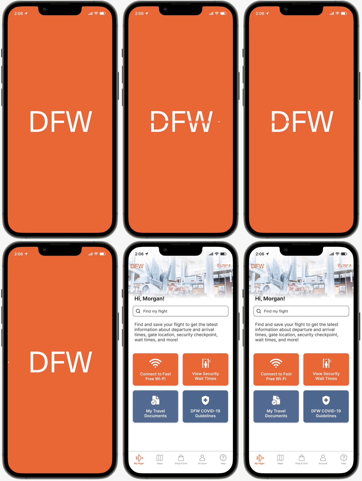
Dallas Fort Worth International Airport
Streamlining the airport journey to optimize throughput and efficiency
BACKGROUND | RESEARCH | PROBLEM | DESIGN | PROTOTYPE | NEXT STEPS
MY ROLE
UX Researcher, UX/UI Designer
TIMELINE
October 2022 | 2 weeks
PLATFORM
iOS mobile app conceptual redesign
TEAM
Garrett Lu, Archana Penumudi, Brian Seo, Caroline Koerschner
METHODS
Client research, User Interviews, Affinity Mapping, Usability Testing, Heuristic Evaluation, Competitive & Comparative Analysis, User Persona, Problem Statements, Journey Mapping, Service Blueprint, User Flows, Site Mapping, Tree Testing, Sketching, Wireframing, Style Guide, UX Writing, Prototyping
TOOLS
Figma, Maze, Optimal Workshop, Trello, Slack, Zoom, Google Workspace, Pen & Paper
OVERVIEW
In the post-pandemic era, travelers face a myriad of obstacles at the airport. From new health and security measures to long lines, crowded retail spaces, and general navigational hurdles in the terminal, stress is practically a guarantee these days.
At the same time, airports have an increased incentive to help expedite travelers through to the post-security area. After all, doing so not only reduces dissatisfaction, but the quicker passengers can get through bottlenecks, the more time they have to shop and dine.
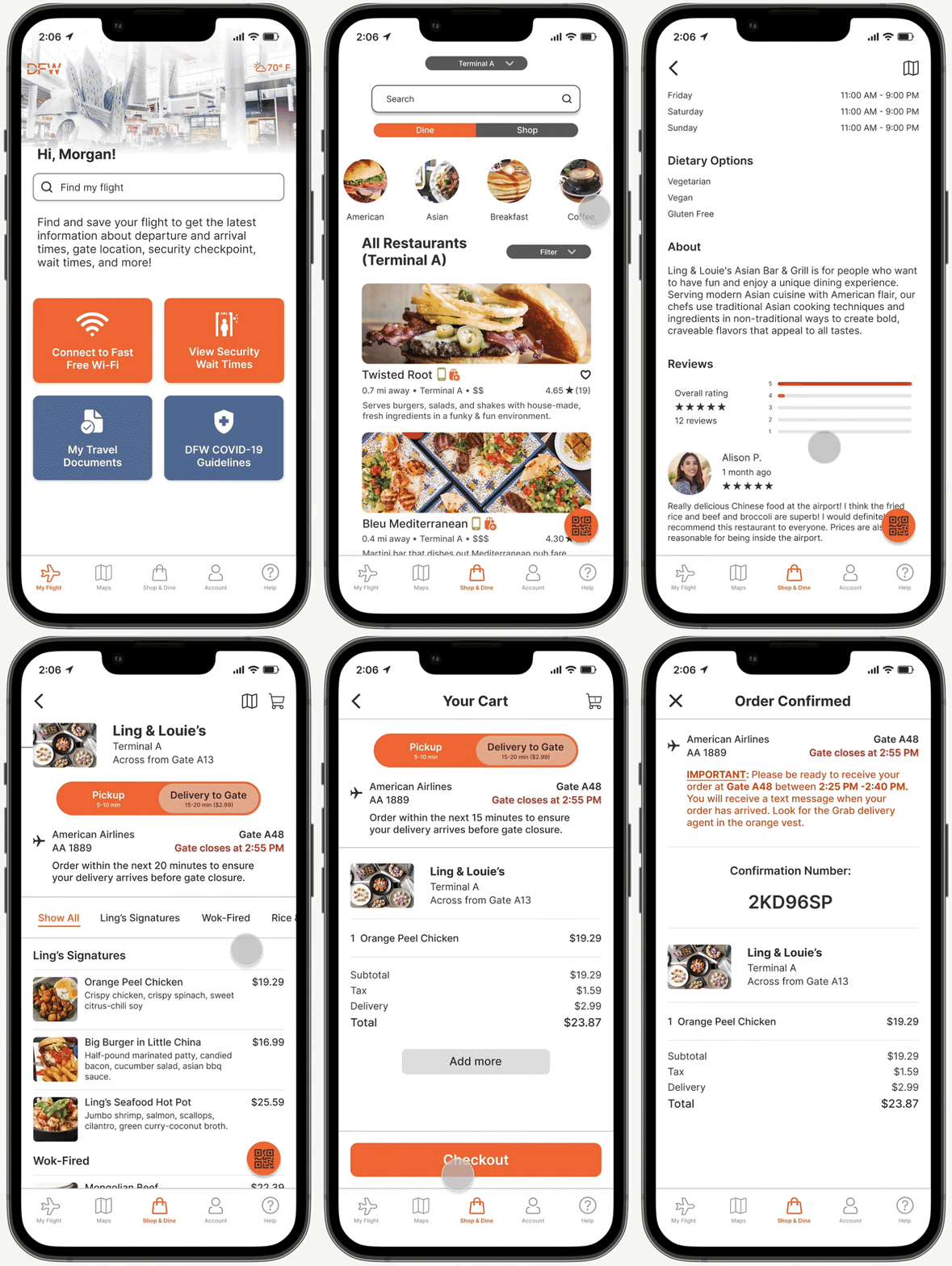
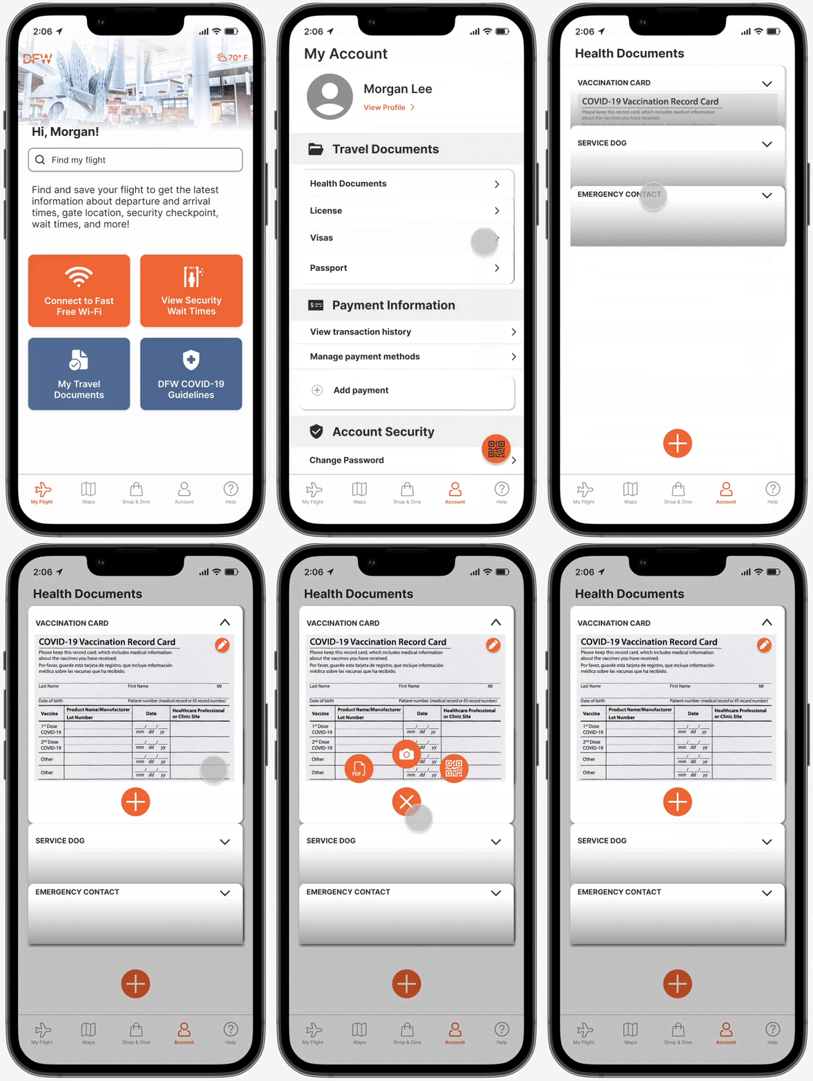
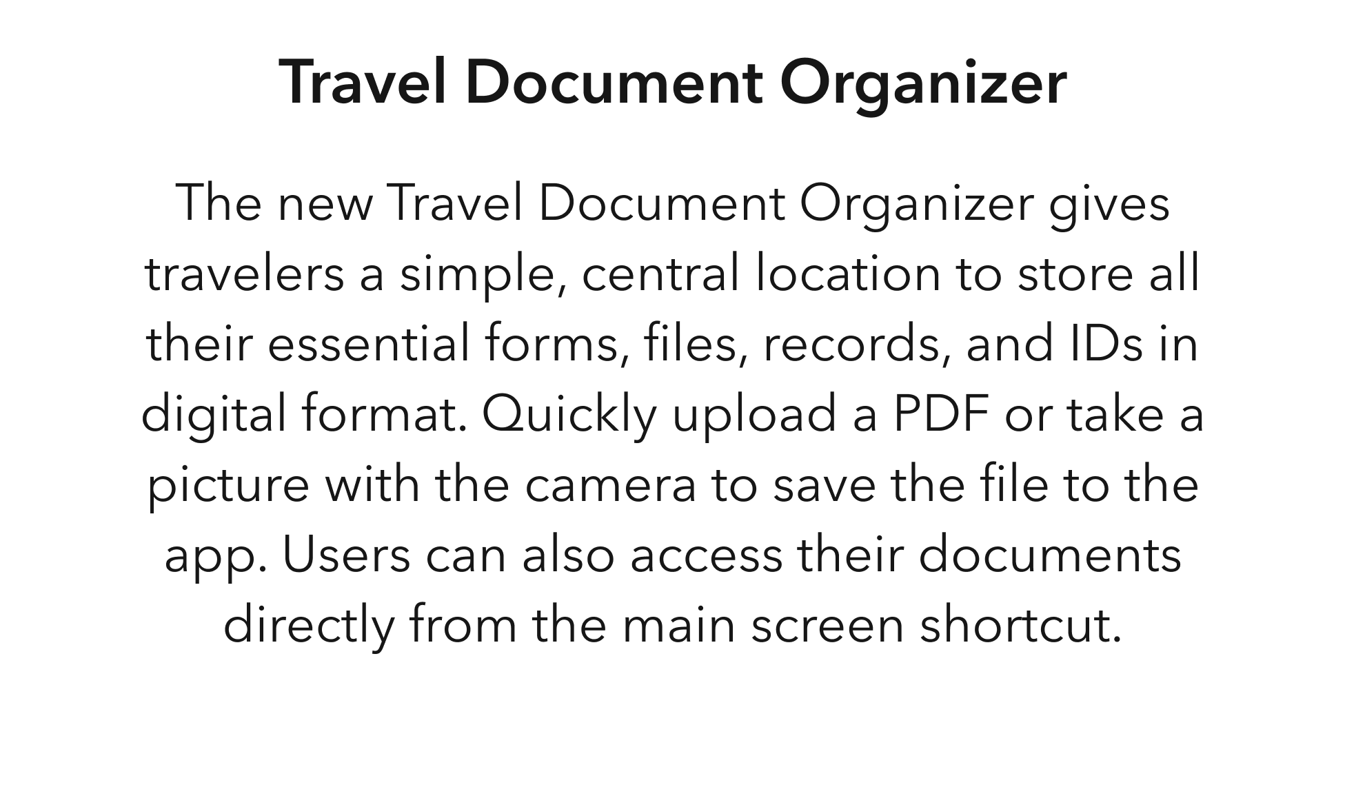
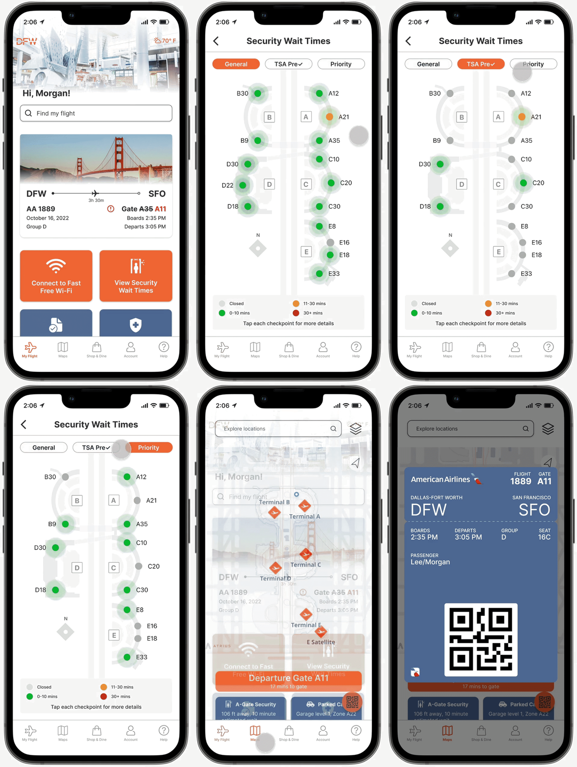
With these challenges in mind, our team reimagined the Dallas Fort Worth International Airport (DFW) iOS mobile app with new features like the journey planner, travel document organizer, and restaurant pre-order and delivery-to-gate. By utilizing digital solutions to facilitate the physical airport experience, we aim to help DFW increase throughput and sales while minimizing passenger wait time and frustration.
Go directly to the iOS mobile app prototype.
Background
01
INTRODUCTION
Dallas Fort Worth International Airport (DFW) is the primary international gateway serving the Dallas-Fort Worth metropolitan area in northern Texas. As of 2021, it is the second-busiest airport in the world by passenger traffic, welcoming over 62 million customers along their journey.
Dedicated in September 1973 and officially opened in January 1974, DFW featured only nine operating airlines during its first year of operation. Today, the airport boasts nonstop service to 260 destinations (193 domestic and 67 international) from a total of 28 scheduled airlines.
THE ISSUE
At its best, an airport can be a destination in and of itself, complete with plentiful shopping, an endless variety of cuisines, and the excitement of new destinations in far-off locales.
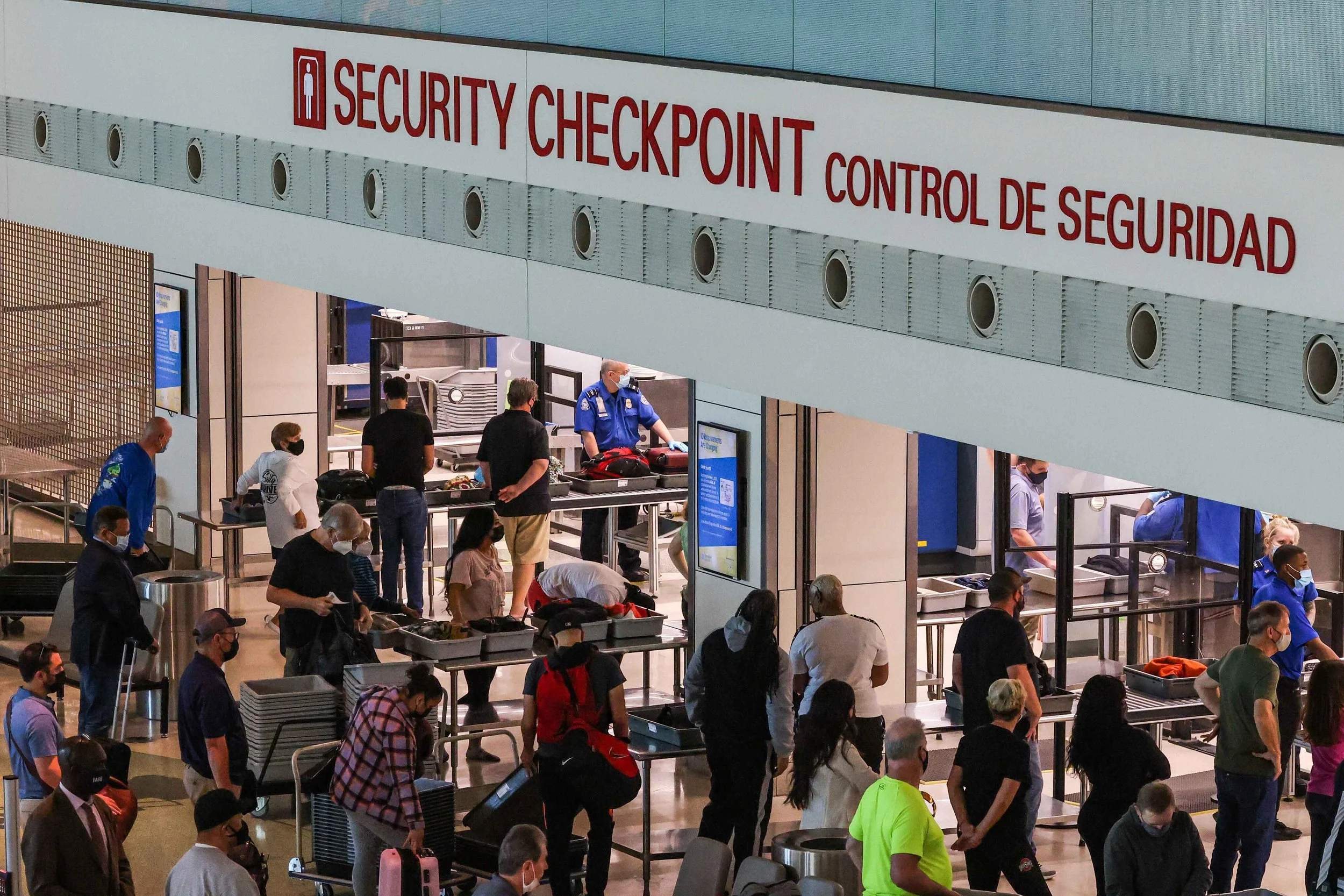
At its worst, however, navigating an airport can be, quite frankly, a nightmare. Congested terminals, long lines, maze-like corridors, and with the recent pandemic, the additional burden of travel documents and health records.
In the post-pandemic era, airports are eager to find ways to expedite passengers through the gauntlet of choke points. From check-in and baggage drop-off to security checkpoints to crowded retail spaces, airports have a strong incentive to help travelers navigate through each obstacle quickly and efficiently.
After all, doing so not only improves the overall airport experience, but the faster people can proceed through bottlenecks, the more time they will have to shop and dine.
PROJECT GOALS
Research
02
PLATFORM RESEARCH
DFW already had an existing website, Android mobile app, and iOS mobile app. Given our two-week time constraint, our first step was to determine which platform we needed to focus on.
Since we were addressing travelers in the process of navigating through DFW, we wanted to prioritize mobile-first solutions – specifically native apps to optimize the user experience. However, with DFW handling millions of international passengers each year, we were split on whether to target Android or iOS. So we dug into the data.
With the vast majority of passenger traffic at DFW being domestic, and with iOS being the dominant platform in the United States, Canada, Japan, and the United Kingdom, it became clear that we needed to address the iOS mobile app first.
Next, we wanted to see which countries had the most number of routes to and from DFW, which would give us a good indication of passenger nationalities.
USER INTERVIEWS
In order to understand the entire airport journey from the user’s perspective, we conducted a total of 6 in-depth interviews with frequent travelers to learn about their process navigating through the airport and the common points of frustration they encounter. Based on the extensive feedback, we created an affinity map to synthesize the data and extract key insights.
Categorizing the points of dissatisfaction into broader groups, we noticed the patterns that began to emerge, highlighting clear areas of dysfunction at the airport.
We also discovered that many of the frustrations expressed by our interviewees could be grouped into similar topics like document organization, navigation, and long lines.
Key Insights:
HEURISTIC EVALUATION
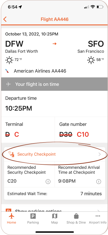
In order to improve the DFW mobile app, we needed to have a clear understanding of its current state. As a first step, we utilized Jakob Nielsen’s 10 usability heuristics for user interface design to identify explicit design weaknesses that could be addressed during the redesign process.
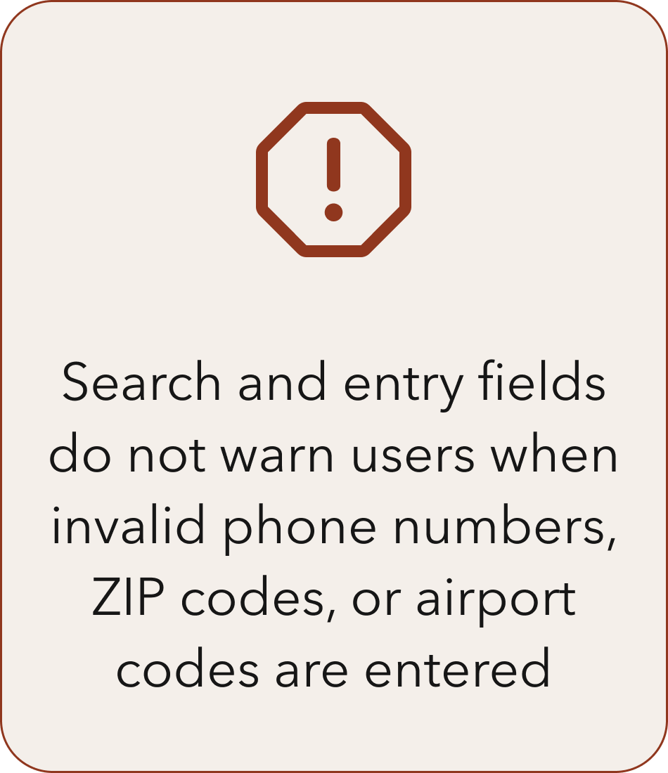
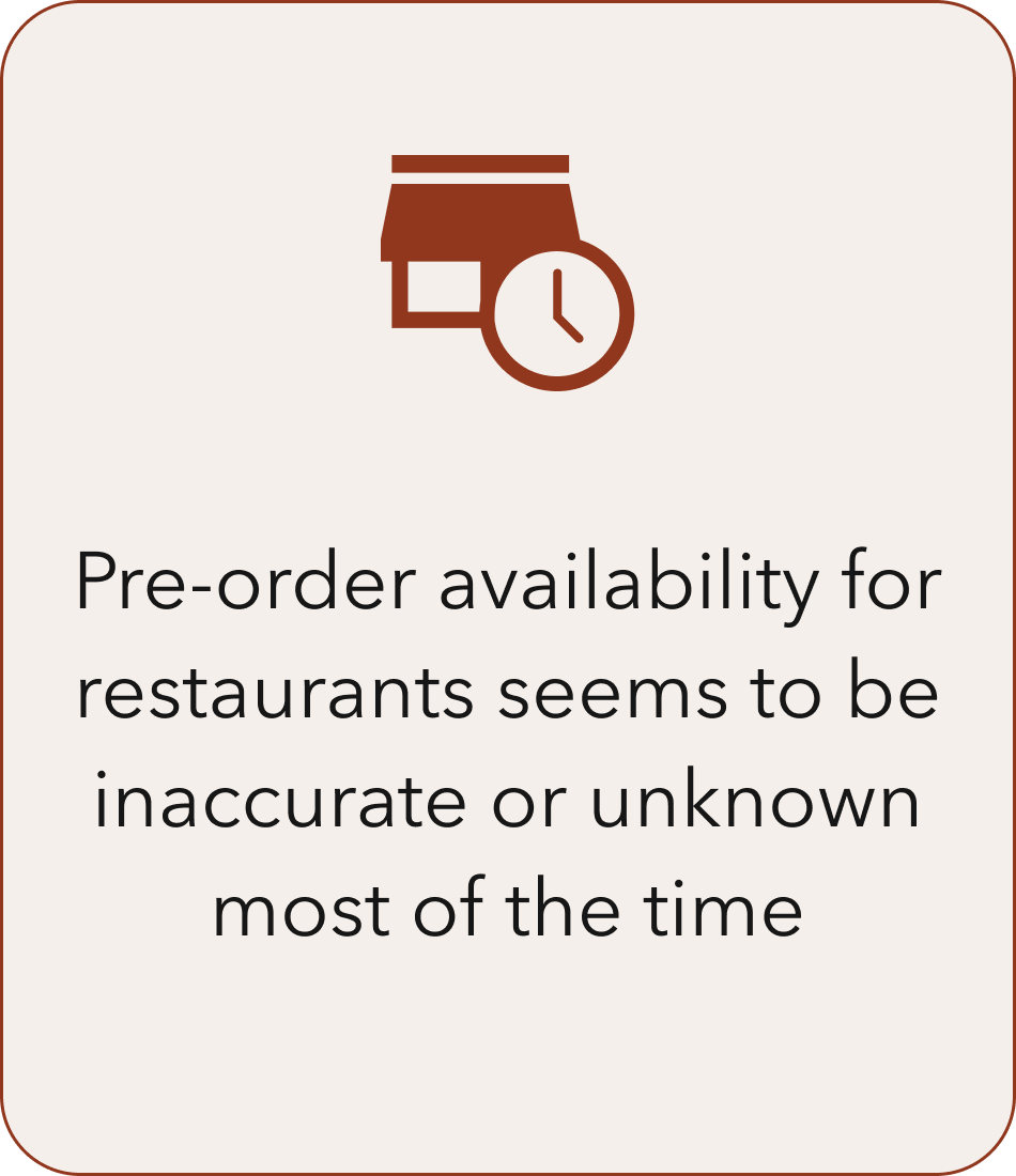
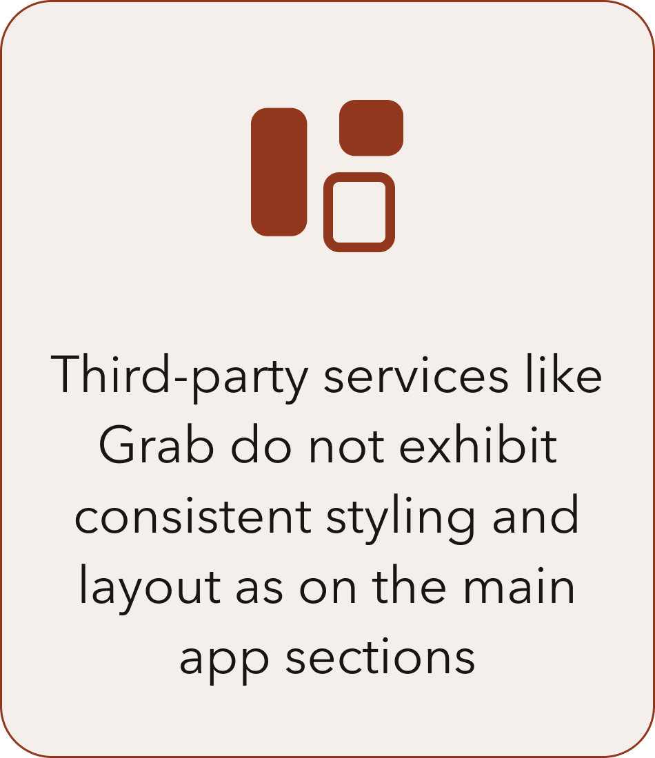
Out of the 10 usability heuristics, we determined that the existing mobile app failed 2 outright, and had room for improvement across several others.
Flexibility and efficiency of use:
Error prevention:
Visibility of system status:
Consistency and standards:
Aesthetic and minimalist design:
C&C ANALYSIS
Conducting a detailed competitive and comparative analysis of 4 direct and indirect competitors allowed us to gain insight into current industry practices and gather inspiration for new features and elements of the DFW mobile app redesign.
USABILITY TESTING
Lastly, we conducted 6 moderated usability tests on the existing DFW mobile app in order to determine how easily users were able to complete 3 common tasks:
Task #1 – Add the DFW → SFO flight on October 11th at 9:03 PM to the app and find the current wait time at the security checkpoint closest to your departure gate.
Task #2 – Find a restaurant you like close to your departure gate.
Task #3 – On the DFW mobile website, use the Journey Planner to plan your airport experience.
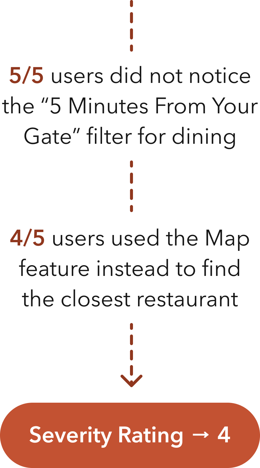
After synthesizing the test results, we discovered some serious issues with each of the features used in the three tasks. Based on how frequently each issue occurred and the impact on users who experienced them, we assigned a severity rating between 1-4, with 1 being minor and 4 being critical.
From the usability test results, it was clear that we needed to make it simpler for users to find the shops and restaurants that best suit their needs. In addition, we needed to refine the journey planning tool to help users make the most of their time and navigate effortlessly through DFW.

Key Research Takeaways
Travelers want to be prepared ahead of time and appreciate services and tools to help them face unexpected situations at the airport.
Long lines are a significant point of frustration, and the issue has been exacerbated in recent years by new health and document requirements.
Travelers feel anxious and stressed when trying to navigate through large, sprawling airports, especially during tight layovers.
Travelers aren’t comfortable wandering too far from their departure gate and would prefer to minimize the risk of missing their flight.
Defining the Problem
03
USER PERSONA
Through the process of creating a focused user persona, we were able to discover recurring behaviors in our research data and narrow down our key insights into the main problems we needed to prioritize and address. Meet Morgan.
Morgan is a tactical traveler who thrives on being prepared for the day of departure in order to minimize stress and complications. Their primary wants and needs can be summarized below.
Morgan’s Primary Concerns
JOURNEY MAP
To help us build a complete end-to-end understanding of Morgan’s airport experience, we developed a journey map to document their potential emotional path while progressing through various obstacles at DFW. Unsurprisingly, we found that much of the experience fell into the negative range of emotions.
Although we could not possibly resolve every single negative aspect of the airport during this redesign, we were able to use the journey map to begin identifying specific touchpoints where digital solutions could potentially make a difference.
THE PROBLEM
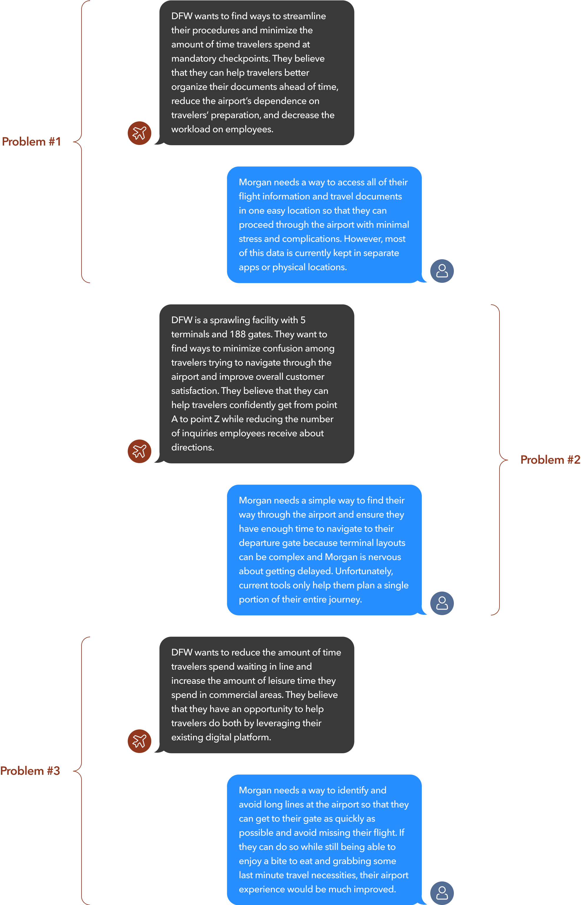
The insights gained from our research and data synthesis allowed us to clearly identify the problems we needed to tackle – from the perspective of Morgan and from the perspective of DFW. After all, the most optimal solutions should benefit both the user as well as the business.
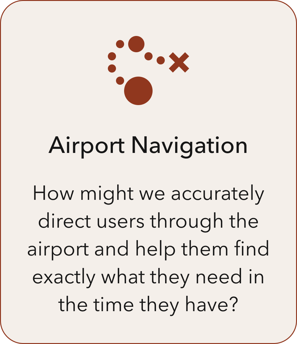
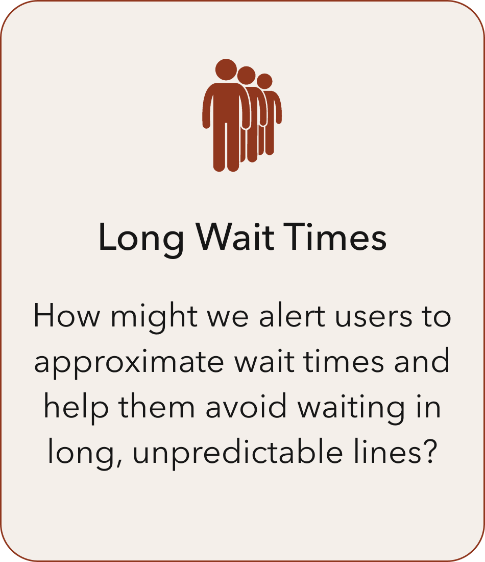
From a higher level, these problems could be grouped into the three main themes, as seen below. Based on these themes, we could start formulating ideas on how we might go about addressing them.
SERVICE BLUEPRINT
For this project, any digital solution that we designed would include a physical counterpart in the form of a process or service. Most of these processes and services would be comprised of airport operations functioning on a daily basis at DFW.
In order to have a full appreciation for any potential solution, we needed to go one step further beyond simply defining the problems to actually mapping out these digital-to-physical touchpoints through the creation of a service blueprint. During the ideation phase, we were able to use the service blueprint to identify specific aspects of DFW’s operations requiring further consideration.
Ideate & Design
04
IDEATING SOLUTIONS
To kick off the ideation phase, we came together as a team to begin brainstorming concepts. We didn’t impose any limits or restrictions on our long list of ideas, but we soon whittled them down to just a few key features that we felt would be fundamental towards addressing the problems we defined earlier.
Key Features:
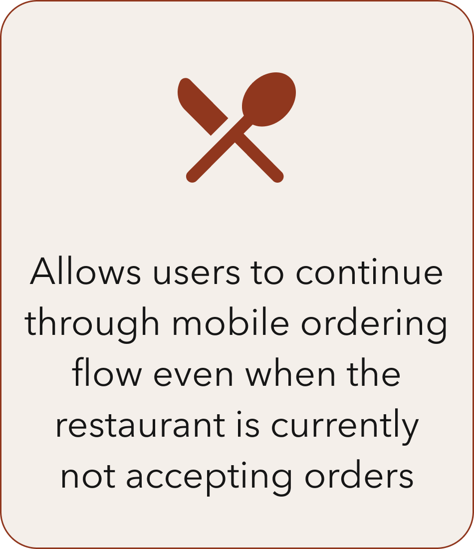
With the key features established, we proceeded to map out how potential design solutions would work in the new app by creating simplified user flows. As an example, the flow below shows how a user would place a restaurant order and have it delivered to their departure gate at a specified time.
SKETCHING
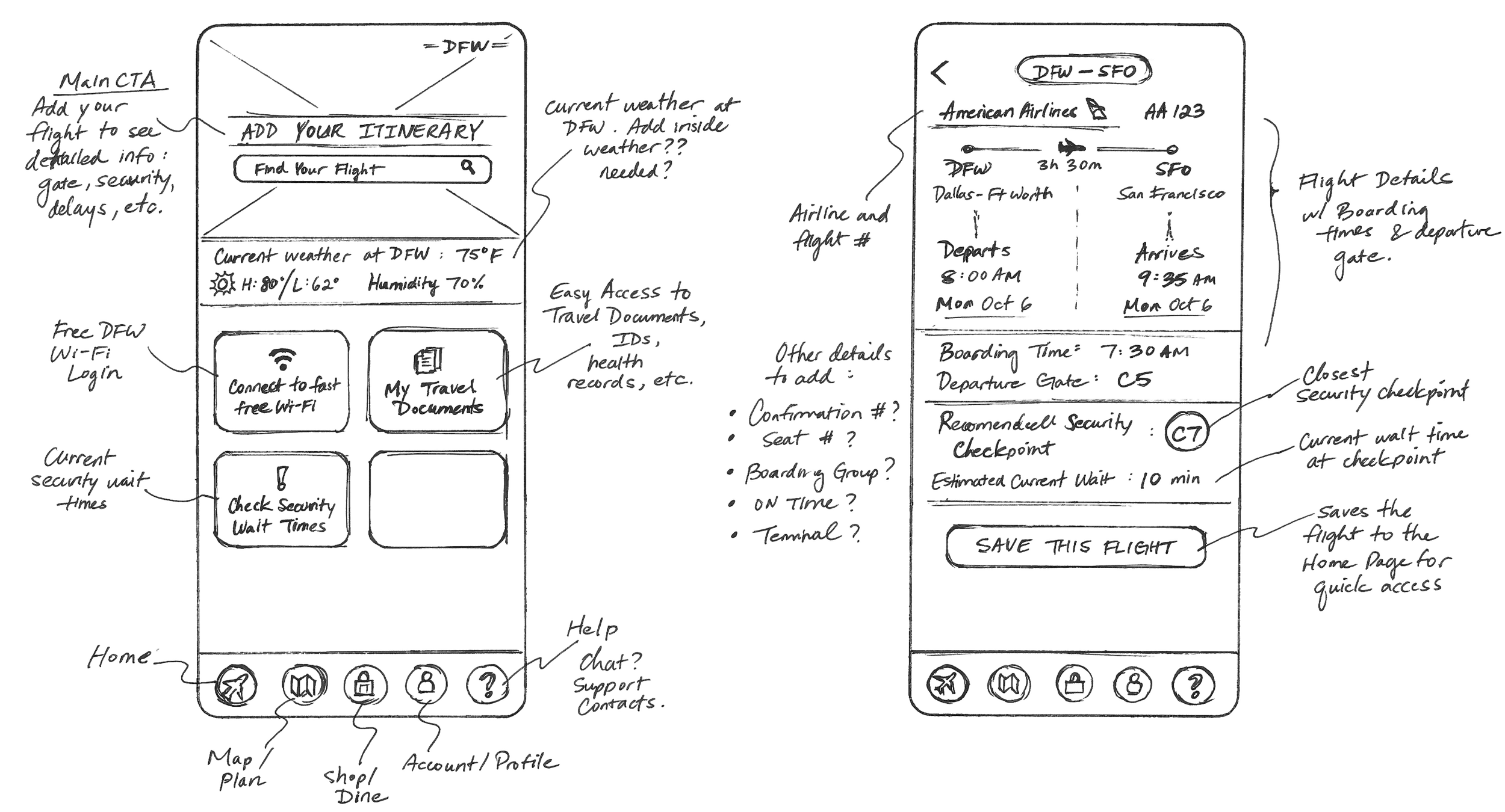
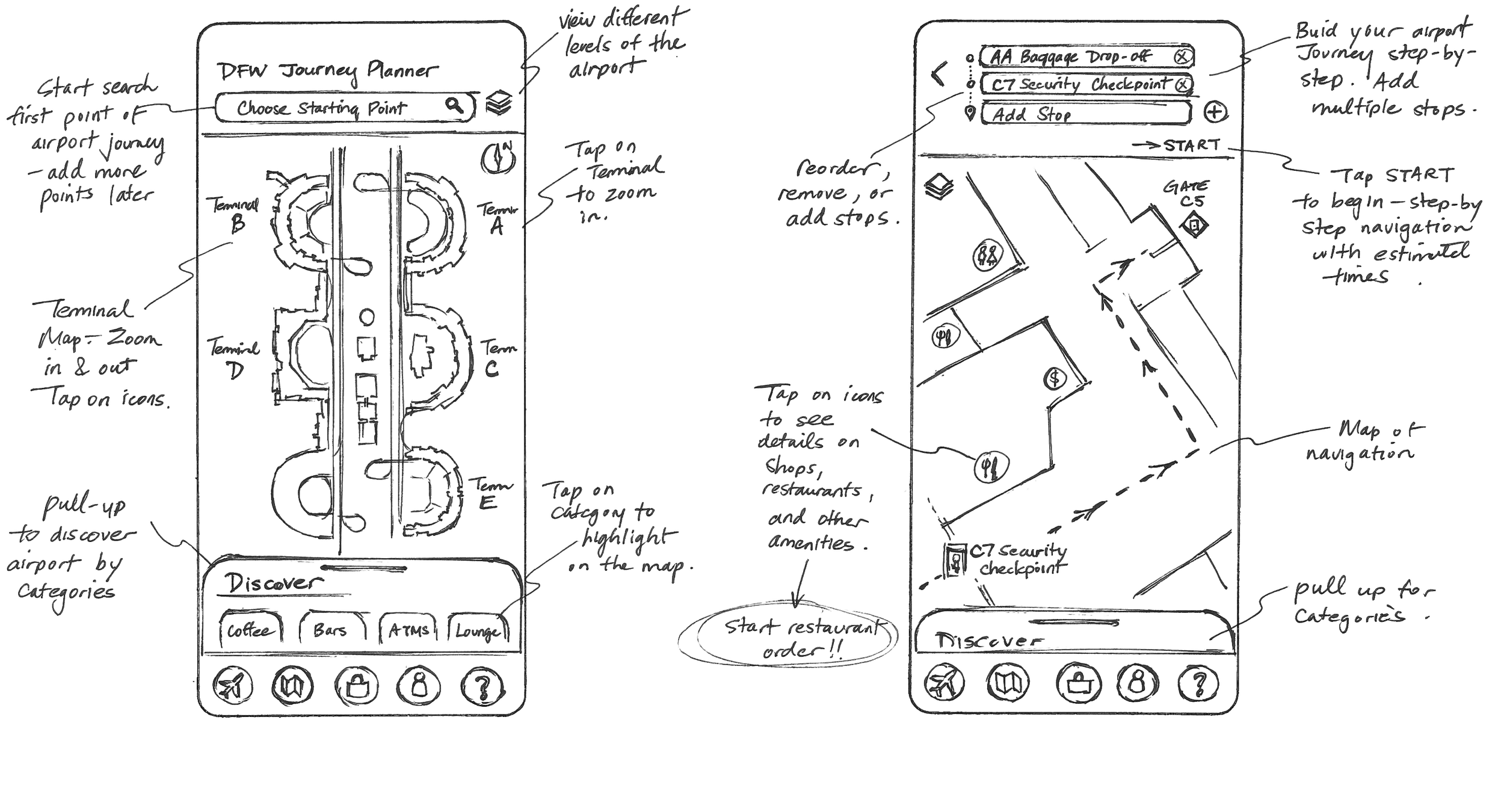
Next, we each sketched out multiple design ideas for the new app layout and came together to discuss and annotate each other’s concepts. We played around with numerous versions of the layout for major features and eventually came to a consensus on how the app should look and feel.
Below are a few examples of the sketches I made for the new home screen as well as concepts for the airport journey planner.
WIREFRAMING
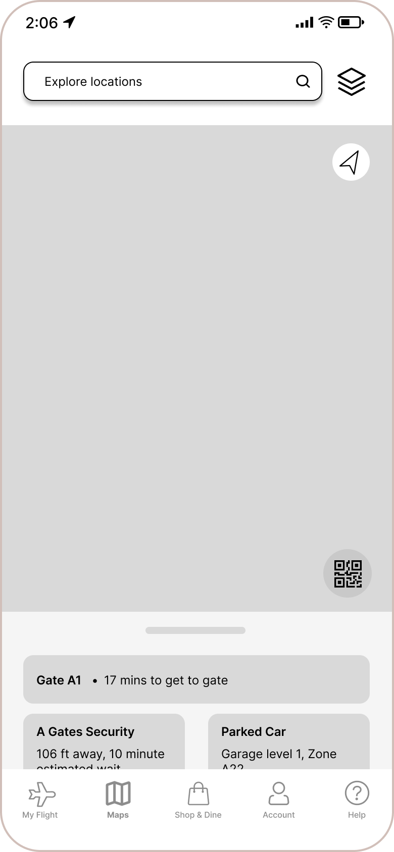
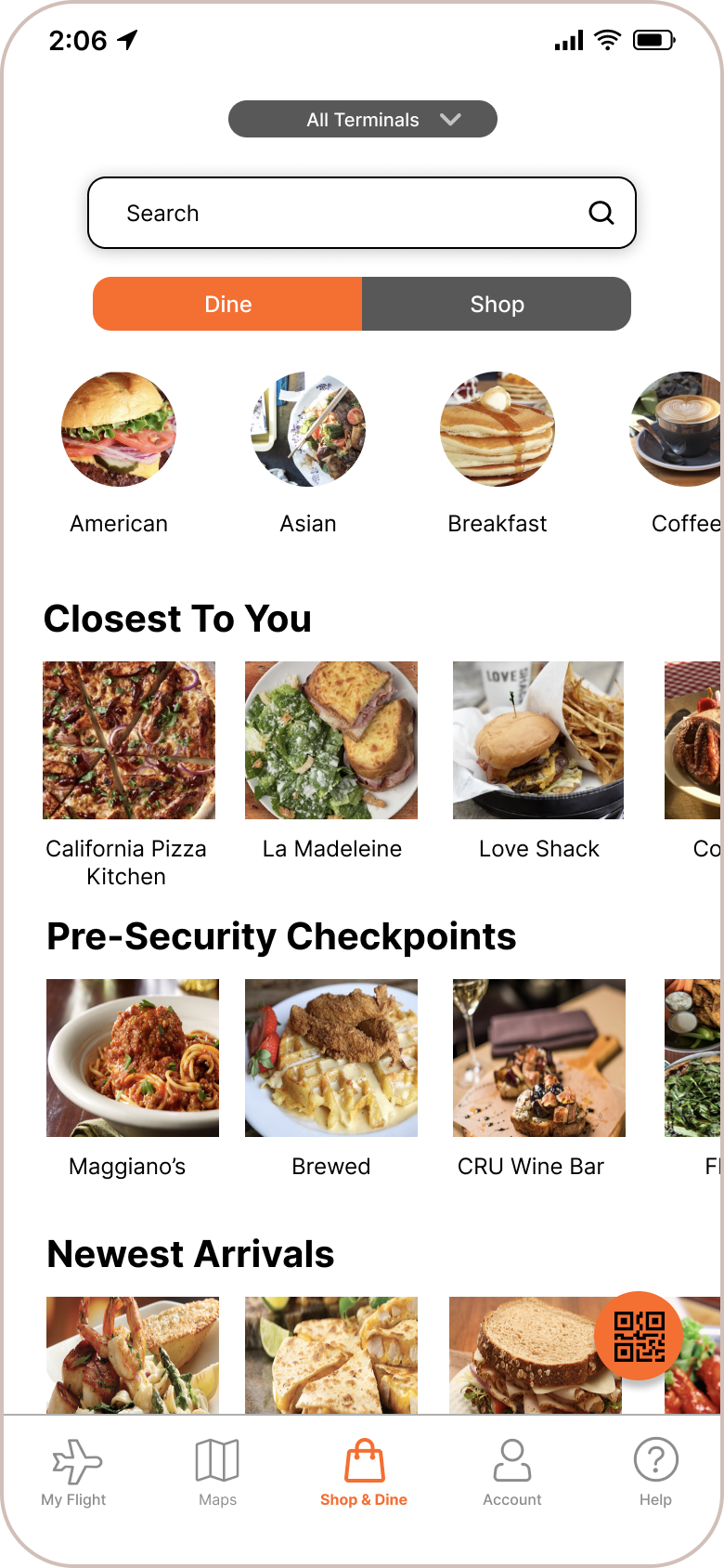
From sketching, we moved on to Lo-Fi wireframing and Mid-Fi prototyping in Figma. In order to meet the deadline imposed by our two-week sprint, we had to limit the main scope to just a few critical user flows that addressed the most essential issues.
Despite the time constraint, we still tried our best to wireframe and prototype as many minor features as possible in order to make this a complete and cohesive app.
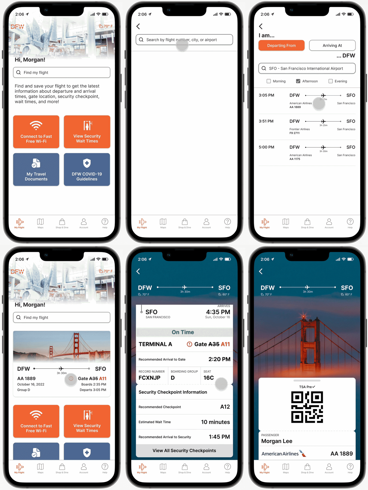
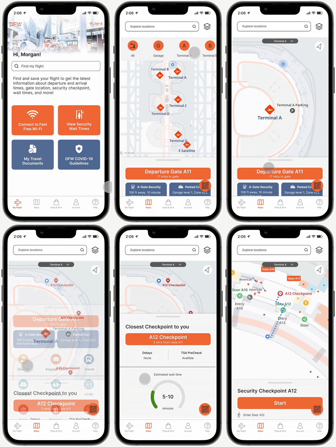
We also made sure to wireframe and prototype other important features like a full flight details card, the travel documents wallet, the security wait times screen, and an entire flow of ordering from a restaurant through delivery-to-gate.
USABILITY TESTING
Before finalizing our Mid-Fi prototype, we conducted an unmoderated usability test with 7 participants to make sure our designs so far were intuitive and functional even without any in-person guidance. We asked users to complete two unique tasks:
Task #1 – Imagine you are currently in Terminal A and are trying to find food. Please show how you would locate a Chinese restaurant in Terminal A using the map.
Task #2 – You want to check your boarding pass to find out your flight boarding group. Please show how you would access your mobile boarding pass.
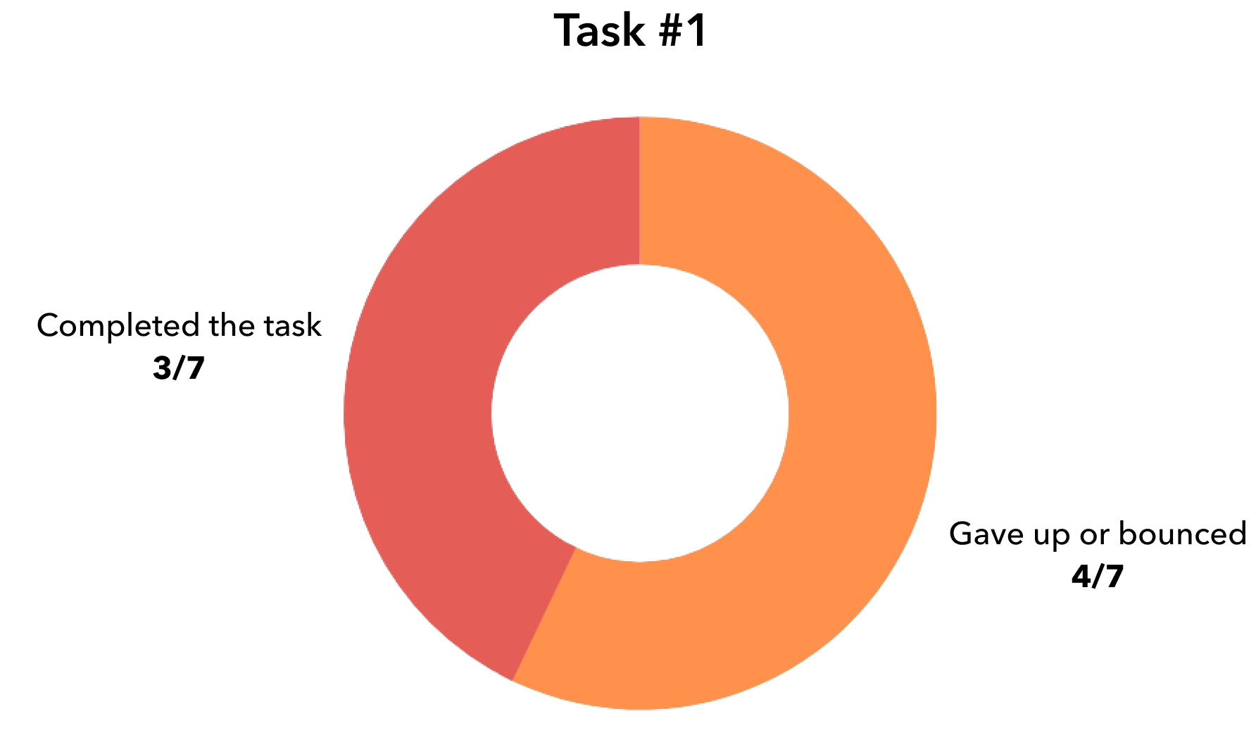
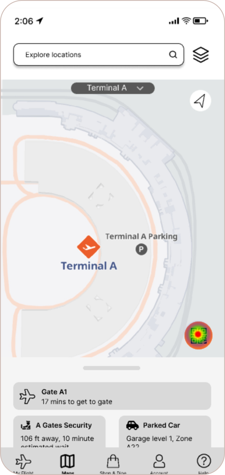
For Task #1, we unfortunately had 4/7 users give up or bounce. This mainly occurred because users were accidentally pressing the boarding pass shortcut while exploring, and since we hadn’t prototyped all the back buttons yet, they became stuck and couldn’t return to the main screen to complete the task.
In addition, we noticed that several users tapped the Shop & Dine feature in order to find the restaurant despite the task prompt, indicating that they might prefer using this dedicated tool instead.
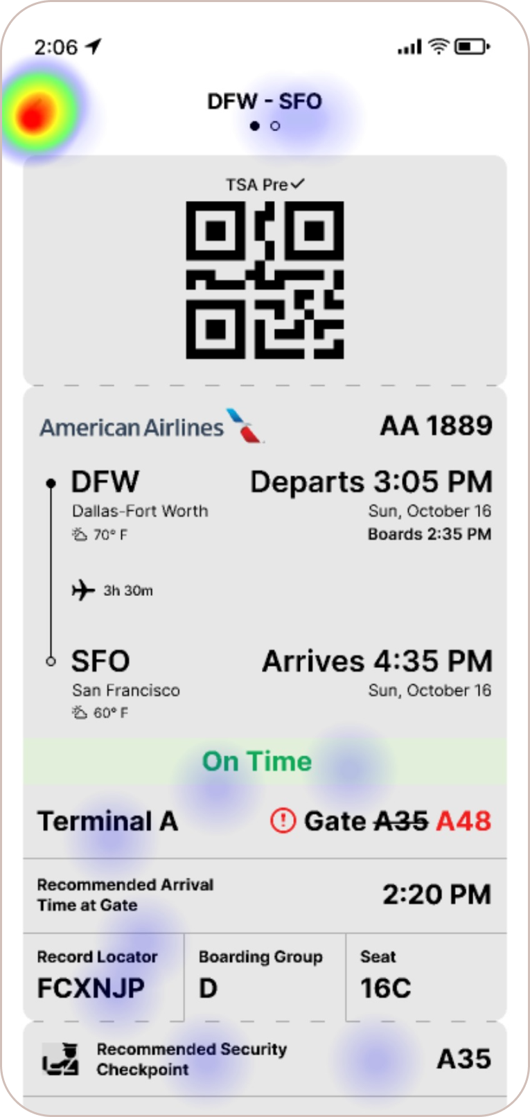
Several users inadvertently completed Task #2 during Task #1 by simply tapping on the QR code image out of curiosity. Every single user eventually completed this task, either directly or indirectly. However, we realized that we needed to redesign this screen as a pop-up to better allow users to exit quickly.
Key Insights:
STYLE GUIDE
Before tackling the Hi-Fi prototype, we wanted to evaluate the existing DFW brand guidelines and make any necessary changes to further enhance usability. We noted that the original DFW orange currently in use was inspired by the sunrise – a marker of optimism and new beginnings.
While it was important to keep the overall palette and feel of the existing DFW brand, we realized based on color and contrast analysis that we needed to tone down the primary orange and incorporate a few more muted colors in order to make the app more accessible and less glaring overall.
Additionally, we opted to replace the existing Neue Haas Unica font with Inter, a sans serif workhorse font that was designed for improved readability and versatility. Also, Inter has the added advantage of including 9 different weights, allowing us to maximize its use in our hierarchical design system.
Lastly, we wanted to make sure the language and tone used in the new app would reflect an optimistic and adventurous spirit, mirroring the DFW brand and travel in general. As a team, we ideated on phrases and themes that we wanted to reference when developing the copy and content.
HI-FI WIREFLOW
We continued to iterate on the Mid-Fi wireframes based on lessons learned from usability testing as well as earlier research. While fleshing out the critical primary flows, we extended the work to secondary and tertiary features as well in order to ensure that we delivered a fully-realized prototype.
Below is the full Hi-Fi wireflow showing all 6 primary user flows. In order to view the wireflow in full size on desktop, please right click on the image and open in a new tab. Then click the image to expand.
PRIMARY USER FLOWS
HI-FI PROTOTYPE
Check out the Hi-Fi prototype below! Feel free to explore the various primary user flows detailed above. Please note that not all flows and features have been prototyped. For hotspot hints indicating where the clickable/tappable links are, simply select anywhere in the prototype.
05
Next Steps
FUTURE IMPROVEMENTS
With only 2 weeks to research, synthesize, design, and prototype a brand new iOS mobile app for DFW, we clearly didn’t have enough time to accomplish everything we set out to do. Many of the new features we ideated ultimately had to be pared down to their most crucial functions in order to be delivered.
Given more time and resources, we would love to continue exploring and enhancing the following:

